Study Center
Study from anywhere with the GARP Mobile App
This was a plan for an application that aligned to the evolution of the Global Association of Risk Professional's customer base. This application would be gated and provide different resources, materials and community/collaboration features to each user type. Exam candidates would see readings, videos, quizzes, practice tests and a study timeline that would be available to view, download or print. Certified risk managers would be able to view different resources to help them stay up to date with different risk management issues and provide notifications about readings or videos for Continuing Education credit.
ROLES
WHAT I DID ON THIS PROJECT
I spent 2 months building out wireframes and mockups for this mobile application. We did not have time to fully implement the design but our intention is to go back at the end of the year and style it better. We used Phone Gap and Bootstrapped the app to get a MVP (minimum viable product) out into the app store. We wanted to see if anyone would use this before spending time on building new features and making revisions to the styles.
The mobile app was recently released on the Apple App store and on Googles store. We are planning on releasing an updated version later this year with the brand new look. Below are some of the wireframes and mockups we used to model the application off of.
Study Materials Page - Page where users would be able to how far along they are reading each article. They would also be able to do practice exams based on the material they were reading.
Search Feature - User would be able to search for anything in the app and bring it up easily. We even wanted to include a glossary in case they needed help.
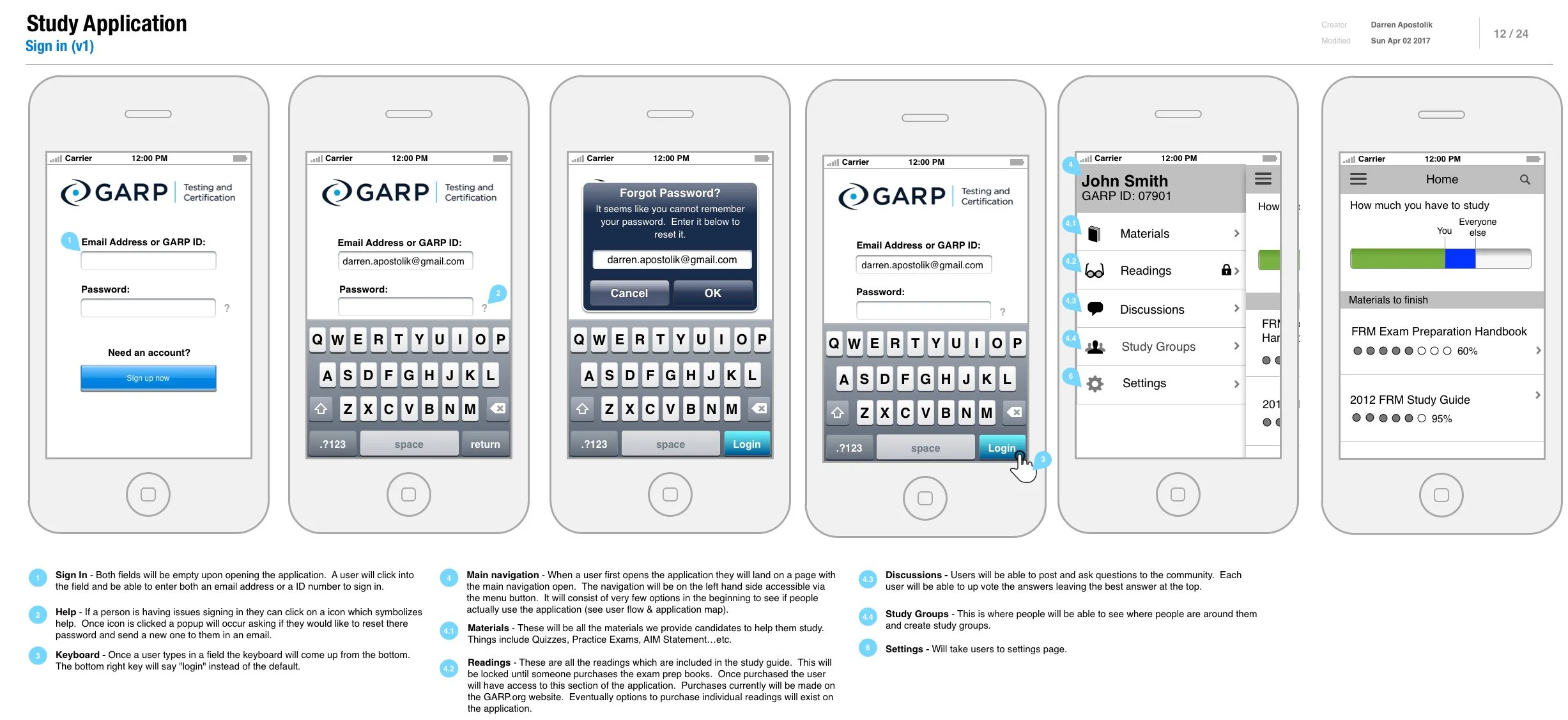
Sign in Page - Wireframe of the sign in page would work.
Final Visuals - After the wireframes were done we applied the colors. These colors were based off our brand style guide. This was an early idea for what the home screen could look like.


