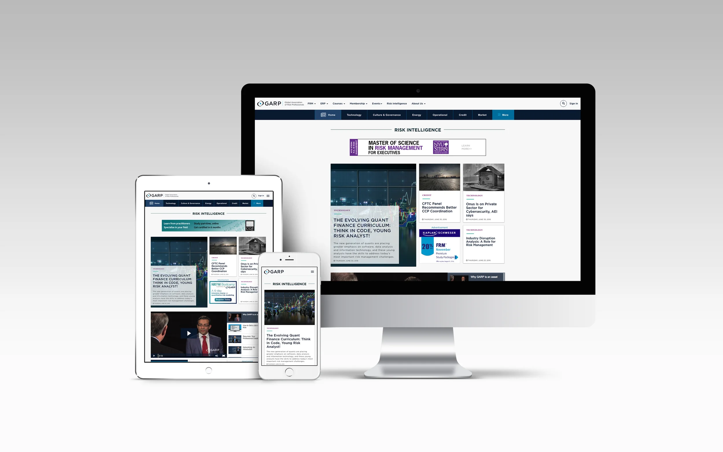
February 2015 we launched a new version of our editorial content section of GARP. We moved from using Umbraco a CMS to Bootstrapping our front-end while using Salesforce running the background as a custom built CMS.
The team decided to create a UI featuring a listing of articles and content in which users would be able infinitely scroll through the content. Advertisements were placed every couple of articles while our own content was mixed in. The dropdown menu was organized by the type of content such as webcasts, white papers, podcasts, news feed…etc. We felt that this strategy of organizing by type of content and infinitely scrolling list was going to drastically increase site visitors to explore the large archive of content we had but it turned out we were wrong. Visitors had trouble finding what they were looking.
ROLES
WHAT I DID ON THE PROJECT
The core team consisted of a project lead and User Experience Designer, Front-end Developer, Visual Designer and a Marketing Lead. I acted as the project lead and user experience designer. Leading the team through the design process from the user research to the final design wireframes and mockups.
USER RESEARCH
FINDING OUR CUSTOMER PAIN POINTS
First thing we did was try and figure out what was wrong with our current site. We looked at analytics and conducted over the phone and in person interviews with our content editors and also some of our members. We wanted to hear directly from both parties to see if we could help address any pain points they had over the current version of the site. The following script was used for our interviews asking questions based on previous answers as we thought of them.
- What is your job title? Job role?
- How did you get to where you are in your career?
- Tell me about how you spend a typical day or week
- What activities take up most of your time?
- Tell me how you use GARP?
- What do we allow you to do, that you couldn’t do otherwise?
- Where do we fall short? What don’t we do well? Where is there need for improvement?
- Are you a part of other associations? What other associations?
- What part of [your job] do you most enjoy?
- How do you know when you are doing [your job] well?
We also analyzed current data from our google analytics and did a break down of who was visiting our site. We found that most of our users were of the younger demographic. The breakdown looked like below:
- Ages 25-34 (Middle Management) —> 45%
- Ages 18-24 (Exam Candidates) —> 20%
- Ages 35-44 (Management) —> 10%
- Ages 45-54 (Management) —> 10%
- Ages 55+ (Chief Risk Officer) —> 5%
Based off these answers and other outside requirements from advertisers we developed a list of requirements and started building out our taxonomy.
TAXONOMY AND INFORMATION ARCHITECTURE
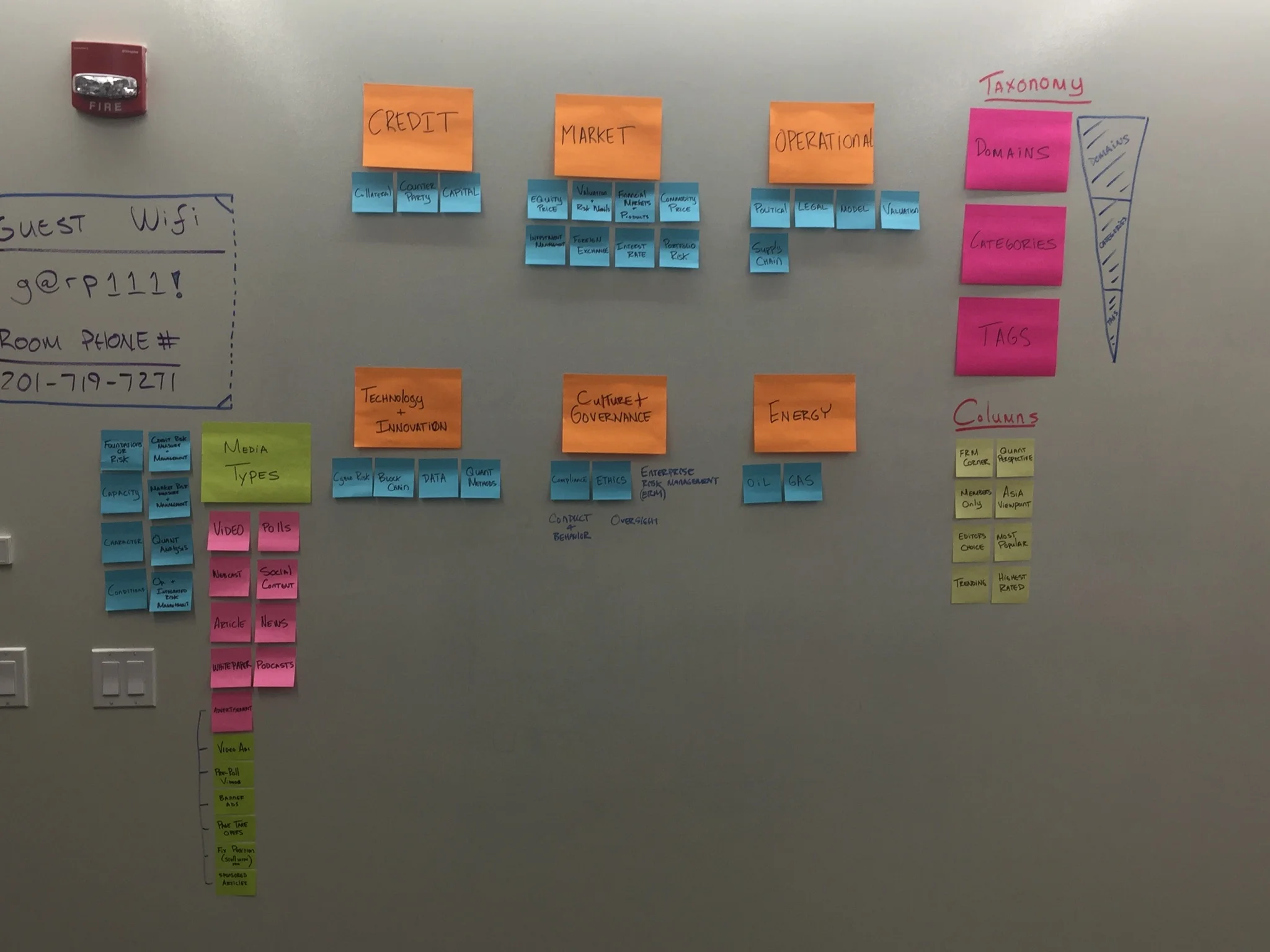
A couple hours were spent in a room with both risk management experts and our editors. We did lots of work to figure out how risk managers wanted to browse the content. At the end of the workshop we left we a usable taxonomy in which we could tag our articles with.
Taxonomy Workshop - We spent a couple hours to coming up with an information architecture that would help users find the content based on the topic they were looking for.
Wireframing and Mockups
FROM LOW FIDELITY TO PIXEL PERFECT MOCKUPS
After doing the taxonomy workshop and coming up with a new taxonomy for the site, I sat down with a one of our front-end developers and started to wireframe out my idea. I wanted to make sure the developer was a part of this process so that he understood what we were trying to do and could ask any questions along the way.
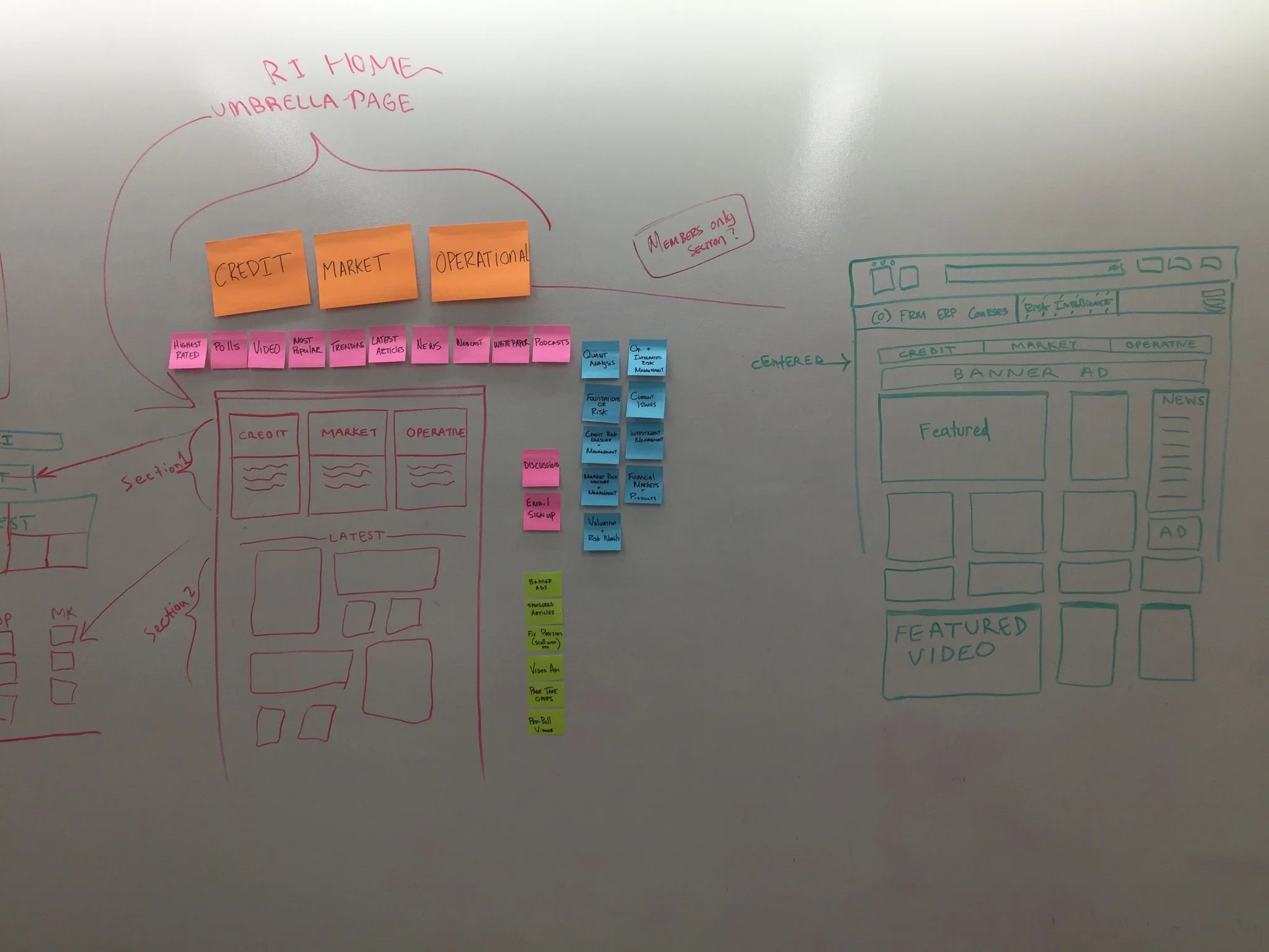
Whiteboarding Workshop - We spent time coming up with an idea for the homepage. We went through multiple ideas before choosing a final one to build out.
Sketching - This is what our initial sketches look like. We wanted to explore the idea of content cards.
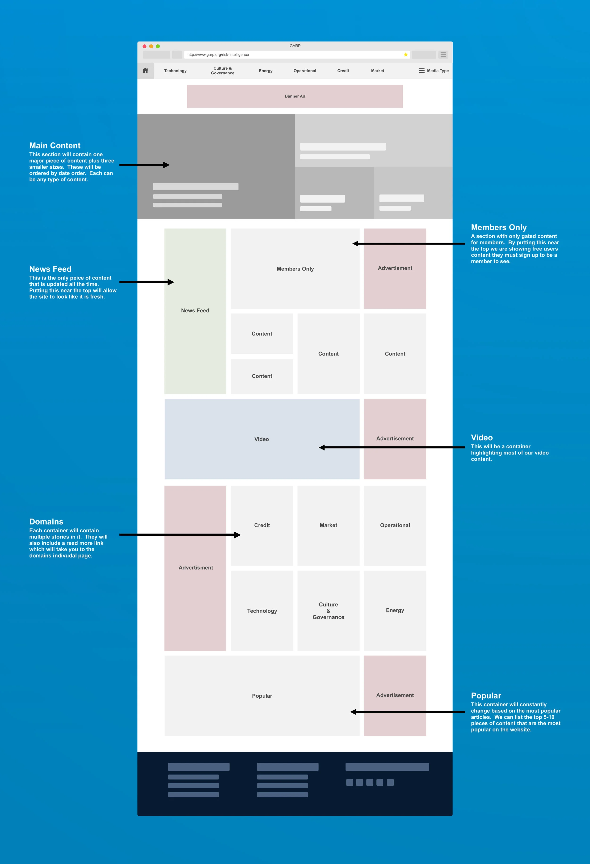
Low fidelity - An example of our homepage wireframe and annotations
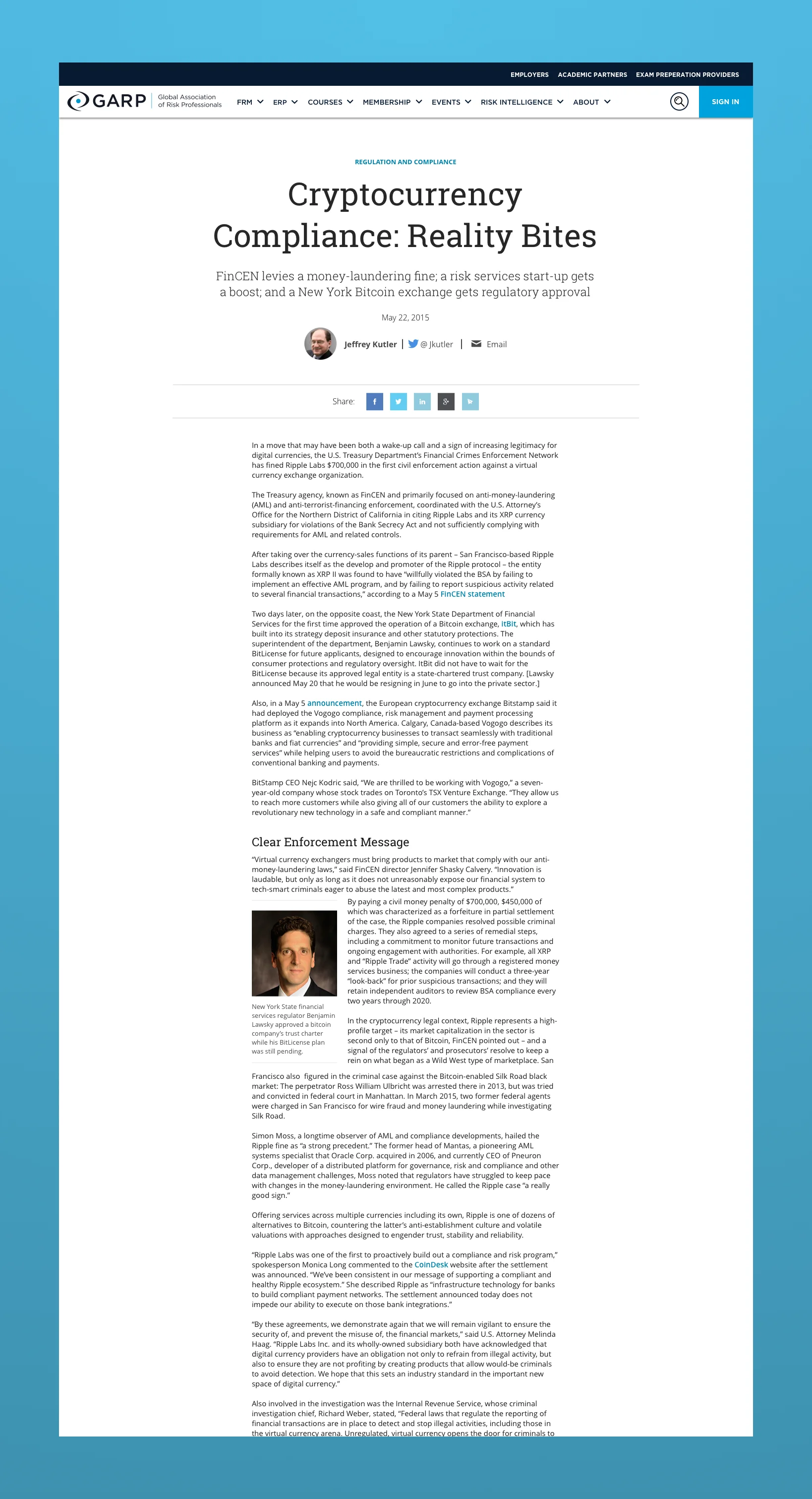
Iteration 1: Article Detail with Body Centered
Our launch article detail page. We kept it simple in order hit our date.
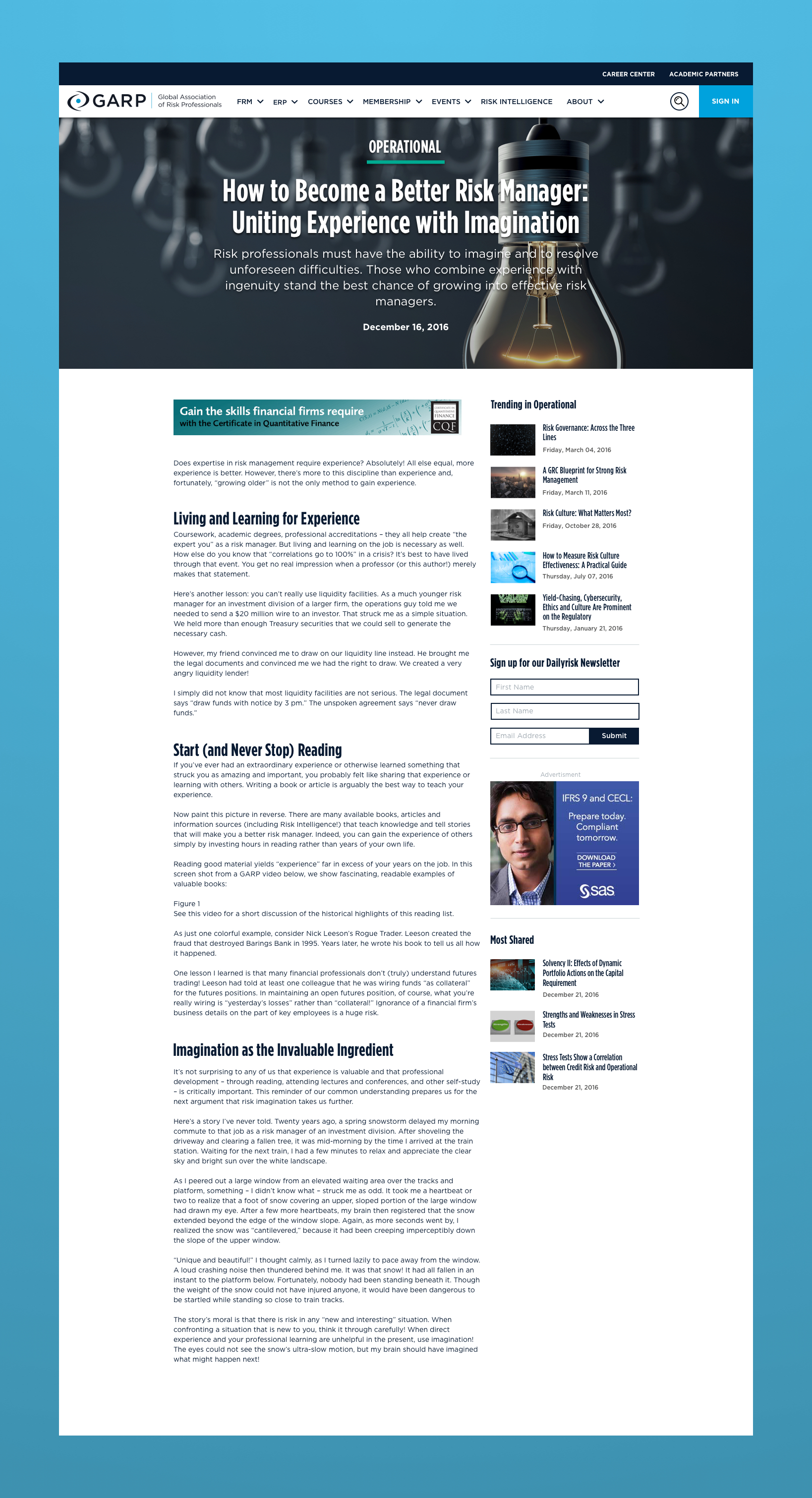
Iteration 2: Article Detail Page with Sidebar
This was is our 2nd redesign of the Article Detail Page introducing a sidebar with Trending Content, Newsletter signup, a 300X250 Advertisement , and Most Shared Content,
SCHEDULING AND DEVELOPMENT
Building and planning development
After building out wireframes and mocksups it was time for us to develop the project. I sat down with our project manager and the front-end developer assigned to the project to break down the mockups into smaller components. These components we would then be built by our developer over an 8 week time period. After each 2 week sprint we would get together and review the previous work to make sure we caught as many issues or concerns upfront.
Development Schedule - This was a photo taken from our meeting on how we would schedule this out. A project manager, front-end developer and myself were involved in scheduling.
