NAVIGATION Redesign
Rethinking the GARP website navigation to cater to how consumers are looking for content
In 2015 GARP launched a new version of its website. In order to launch on time and in budget the site was launched replicating the previous website but with an updated look and new backend (we moved from a custom built 10 year old database which was falling apart to using Salesforce). During this time we decided to use the exact same taxonomy for our content and information architecture for our website. This past summer we finally had the chance to rethink our navigation to fit how our consumers were actually using our site.
CHALLENGE
HOW MIGHT WE ORGANIZE OUR CONTENT TO HELP CONSUMERS MAKE FASTER NAVIGATION DECISIONS
After combing through our analytics and sitting with potential website consumers we found three issues.
- Our website navigation and information architecture was designed exactly how our company operated. Each product in the company had an item on the navigation. This was leading to confusion from our consumers over which type of product and what the difference between the products were.
- We found that internal speak (acronyms we created for our products internally) did not translate well to the external users especially for consumers who's first language is not english. Our user would come to the website not knowing what the acronym stood for causing confusion on which product they should purchase.
- Sign In was not highlighted enough. Users were skipping over it leading to less people signing in to the website.
APPROACH AND SOLUTION
PROGRAMS AND RESOURCES
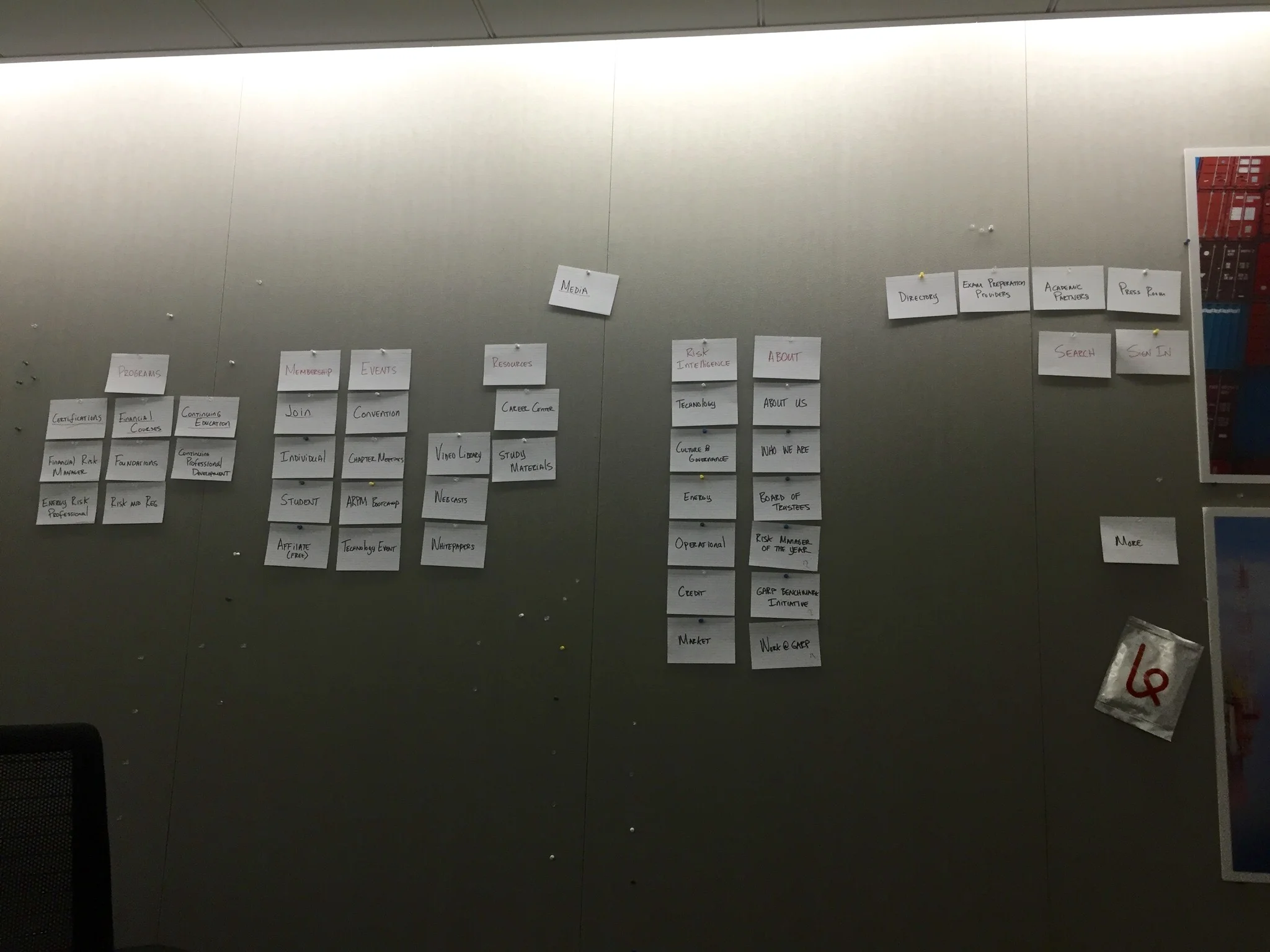
In order to help solve what we found as pain points for our consumers we ran a couple card sorting workshops with consumers and internal project managers. We put all the items in the navigation on index cards and asked everyone to bucket the cards together. Once bucketed together we would probe a little for why they put them together.
Card Sorting - We took all the navigation items and wrote them on index cards. The idea was to bucket the items in a logical taxonomy based on what our site users were looking for.
After four rounds of this we started to find similarities.
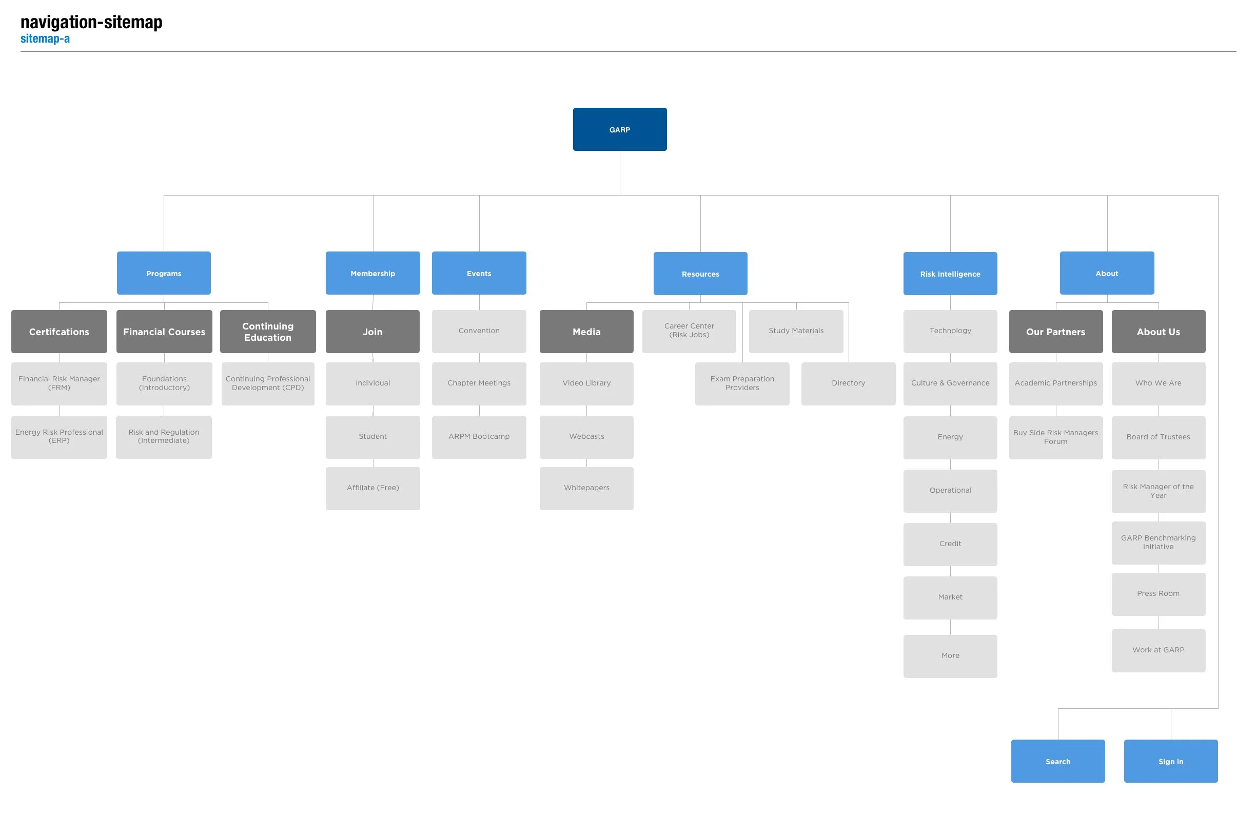
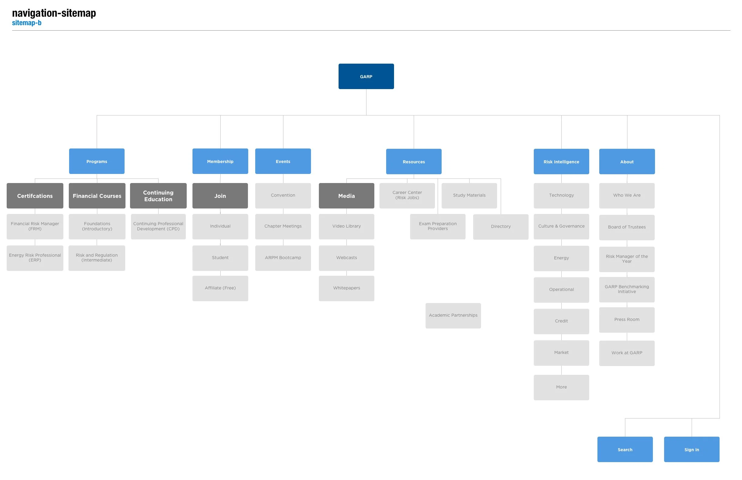
- Our exams and courses were consistently bucketed together - We decided on bucketing them in a "Programs" dropdown
- Most of our tools ended up in one pile - We ended up on calling them "Resources"
Our final solutions looked like the ones below. We pitched this back to our management team with user research and it was decided we would hold off on this architecture change until our next exam cycle.
Even though we did not get to implement the final fully finished design we did get a chance to visually bring the navigation up to web standards. The previous version looked dated. Our new version used the same architecture but highlighted signing in. We have noticed a uptick in users signing in but are currently monitoring analytics to see if this is a constant trend. Hopefully we will be able to revisit this project in the future.


