Beat.Box
Branding a music streaming service
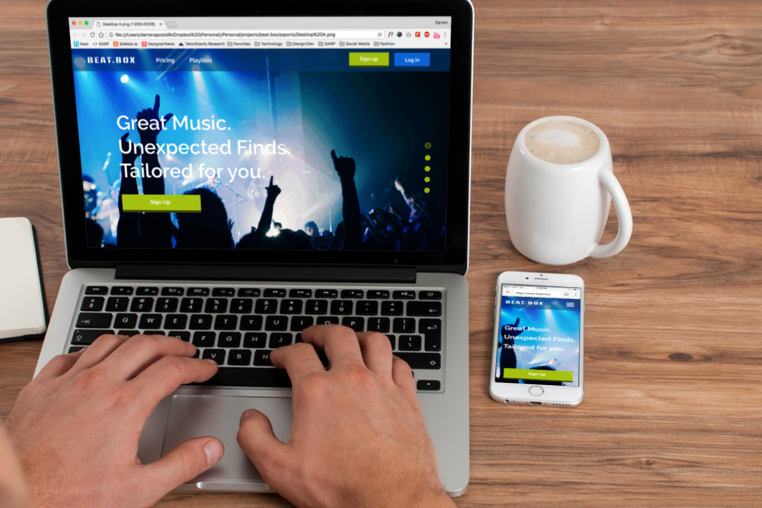
Beat.box is a music streaming service geared towards millennials. The project consisted of creating a vision for what the brand might look like and how it would be applied to the homepage of the website. All content on the mockup was provided by the client.
Approach and Process
On this project I followed a 4 step process which helped me come to the final look and feel.
- Research - To start this project I did a short research project and looked other competition in the music streaming industry. I went to multiple streaming services websites did a color/brand comparison to see if there were any insights I could gather to use on my own design.
- Fonts and Colors - After looking at other website and seeing common color patterns I did research on possible font pairings and a possible color scheme. Since different colors give different feelings of emotions I landed on a variations of using blue as the primary color. The color blue reduces stress and has the feeling of safety. I wanted this music service to make the users feel calm and really feel like they are "One with the music".
- Wireframe - This is where the content was married to the layout. After doing two options of layouts for each section I added the copy to see if it fit together.
- Mockup - From the mockup colors were applied and the original wireframes were modified a little to make a consistent look and feel. I went on numerous version and getting constant feedback in between each round.

